Topic: How to change page layouts
Description: Learn how to change page layouts for a publishing page and view the Sproket Page Layout Gallery and Features
Related Image:

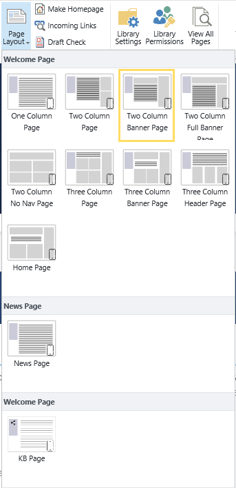
Table of contents:
1.How to update a page layout
2.Sproket Page Layout Gallery and Features
1.1. Navigate to your relevant page
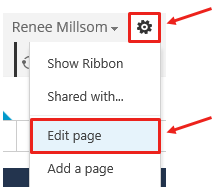
1.2. Click on the Settings wheel > Edit Page
Located in the top RH corner click on the ‘Settings wheel’ and then ‘Edit Page’
This will take you to the ‘edit mode’ of your page
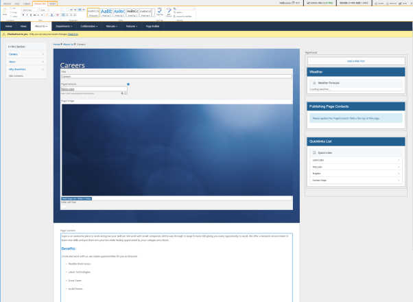
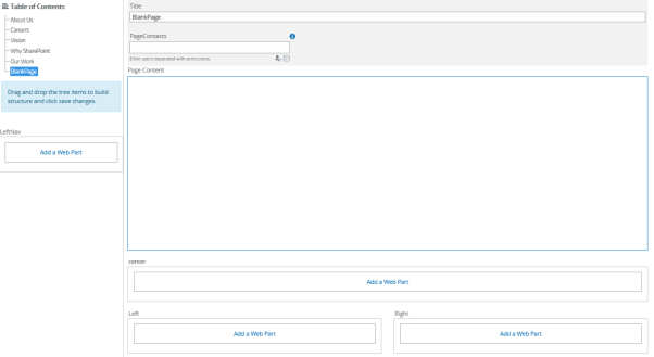
Here you will see how the page is currently set up
Ie Page Image, Right Panel, Page Content, Webpart zones etc
1.3. Navigate to the ‘Page’ tab
Located in the top ribbon, click on the ‘Page’ tab
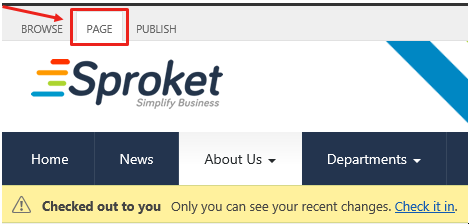
1.4. Click on ‘Page Layout’

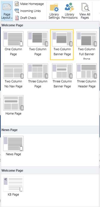
1.5. Select a page layout
Select from a range of Sproket Page Layouts (refer to the Page Layout Gallery and Features), all pages have been designed to be responsive on mobile devices
1.6. Rearrange your page
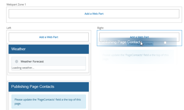
Now that you have updated your page layout you may notice your webparts have moved slightly on your page.
Using Internet Explorer you can drag and drop your webparts into different webpart zones to re arrange your page layout
1.7. Save, Check in or Publish your page
Now that you have updated your page you can now ‘Save’, ‘Check in’ or ‘Publish’ your changes.
If you wish to preview your changes first then select ‘Save’ or ‘Check in’ to ensure your changes are not visible to general users
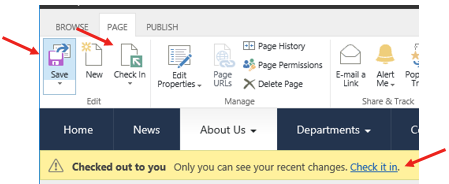
ie
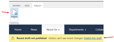
‘Publish’ your page once confirmed so general users can see your changes
Within Sproket there is a number of Page Layouts to select from to design your SharePoint publishing page. All layouts are responsive on mobile devices.
Chose a page layout that suits you
2.1. One Column Page
• Title
• PageContacts
• Hide Left Nav
• Page Content
• One column of Webpart Zones (split for left and right panels)
• Breadcrumb trail
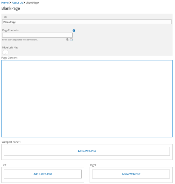
2.2. Two Column Page
• Title
• PageContacts
• Hide Left Nav
• Page Content
• Two columns of Webpart Zones (with right hand panel)
• Breadcrumb trail
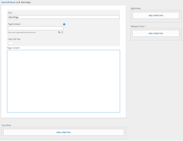
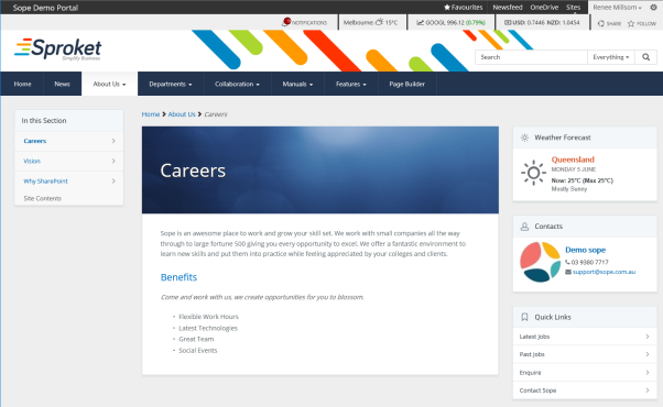
2.3. Two Column Banner Page
• Title (text overlay over Page Image)
• PageContacts
• Page Image (banner image extends across 1 column)
• Hide Left Nav
• Page Content
• Two columns of Webpart Zones (with right hand panel)
• Breadcrumb trail
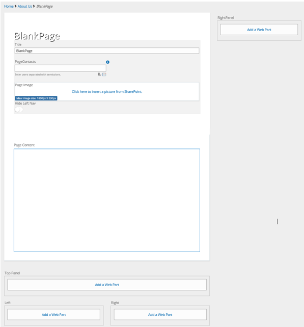
2.4. Two Column Full Banner Page
• Title (text overlay over Page Image)
• PageContacts
• Page Image (banner image extends width of page)
• Hide Left Nav
• Page Content
• Two columns of Webpart Zones (with right hand panel)
• Breadcrumb trail
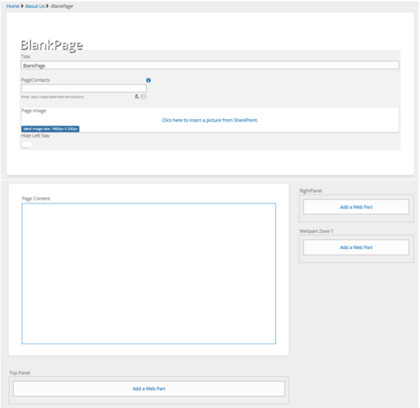
2.5. Two Column No Nav Page
• Title
• PageContacts
• No left navigation
• Header zone (white background)
• Two columns of Webpart Zones (split for left and right panels)
• Breadcrumb trail
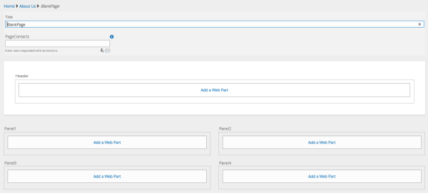
2.6. Three Column Page
• Title
• PageContacts
• Hide Left Nav
• Page Content
• Three columns of Webpart Zones (with right hand panel)
• Breadcrumb trail
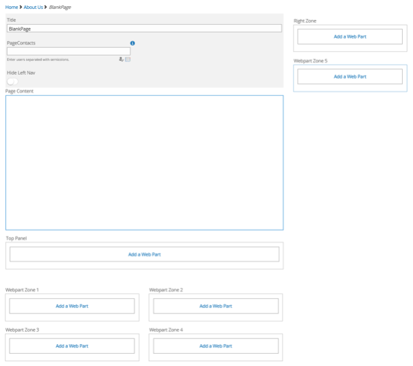
2.7. Three Column Banner Page
• Title (text overlay over Page Image)
• PageContacts
• Page Image (banner image extends across 2 columns)
• Hide Left Nav
• Page Content
• Three columns of Webpart Zones (with right hand panel)
• Breadcrumb trail
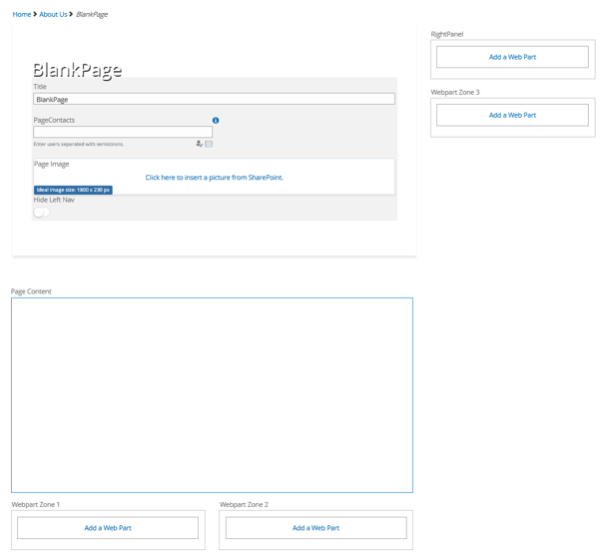
2.8. Three Column Header Page
• Title (text overlay over Page Image)
• PageContacts
• Header zone (white background)
• Hide Left Nav
• Page Content
• Three columns of Webpart Zones
• Breadcrumb trail
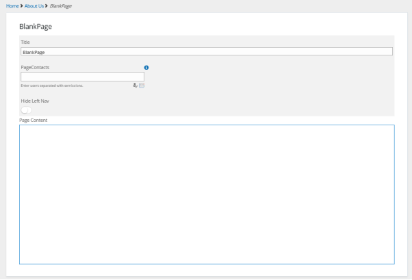

2.9. Home Page
Intended for Home page use only
• Title
• PageContacts
• Section for Banners and Promo Panels
• No left navigation
• Page Content
• Two column webpart zone for News and Social
• Right hand panel for Quicklinks, Weather, My Account etc
• No breadcrumb trail
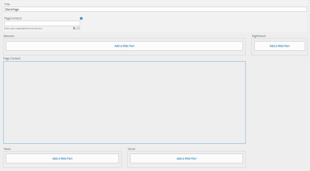
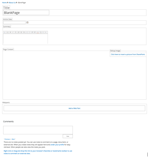
2.10. News Page
Intended for Publishing News articles only
• Title
• Article Date
• Summary
• Page Content
• Roll up Image (positioned on the RHS of the page content)
• Webpart zone
• In-built comments
• Breadcrumb trail
2.11. KB Page
Intended for Knowledge Base or Policy Hub (a way to build a tree structure for your navigation)
• Title
• PageContacts
• Page Content
• Webpart zones (split for left and right panels)
• Table of Contents (ability to drag and drop pages to build a heirachy of pages)
• No breadcrumb trail
• Left hand webpart zone
