Topic: How to export data to Excel and generate reports
Description: Learn how to export data to Excel and summarise it using pivot tables and charts. Add charts to SharePoint pages and refresh excel from SharePoint list.
Table of contents:
1.Exporting data to Excel
2.Summary Reporting of the Excel data
3.How to add chart to SharePoint page
4.Refresh Excel reports from SharePoint list data
Note: for this training task, it will be necessary to use “Microsoft Internet Explorer”
Locate the required list and you will see the current data which sits within it:
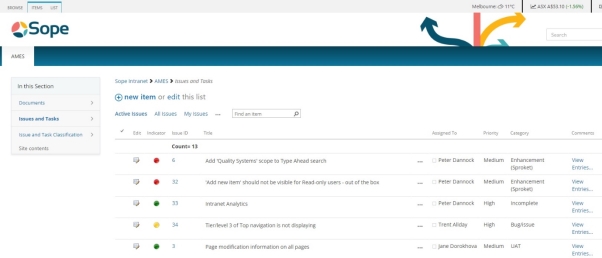
Navigate to the Site Ribbon and within the List tab you will see an icon which says Export To Excel
(Note: Ensure you are within Internet Explorer for this)

You will be prompted by a pop-up at the bottom of your screen asking if you wish to Open or Save this document. Select Open for the mean time.

This will immediately prompt your Excel to launch. Before any of the data is displayed, you will be prompt with another box titled Microsoft Excel Security Notice.
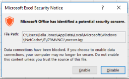
Ensure that you select Enable for this  . This will allow your excel to be linked to your Sharepoint List/Data.
You will then see your data imported into a table format within your Excel Workbook.

To begin with simple summaries of your information, select your entire table and ensure all of your rows are highlights as above.
Navigate to your Site Ribbon and select the Insert Tab. If you are currently within SharePoint 2013, you will see the options of Recommended PivotTables.

Select on this Icon and you will be prompted with filters that Excel has recognised from your columns
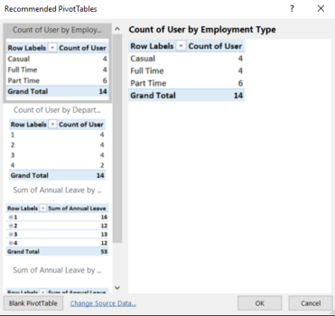
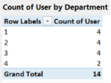
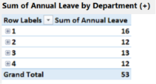
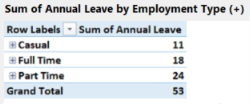
Based on the data sititng in your Sharepoint List, Excel can categorise and summarise your information by these default tables:
For example:
By Employment Type

By Department
By Annual Leave / Department
By Annual Leave / Employment Type
Navigate back to the Insert tab within your Site Ribbon but now select the icon which says Recommended Charts

Just as the Pivot Tables, Excel will offer a series of Charts and Data Displays based on the Columns and information within your SharePoint List.
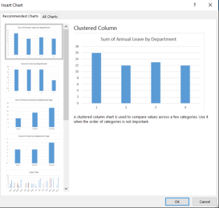
These chart types will range from Column, to Pie charts and so forth. Once you have selected a chart, you will also have the flexibility to modify it and edit the fields.
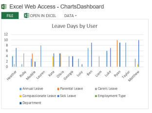
In this example we selected Clustered Column by User
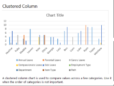
Once you have pasted your chart, select individual fields you wish to either modify or remove
In this example I want to remove Path 
All I must do is select it and click Delete to remove this cell.
Otherwise, if I click on any of the cells within my graph, it will immediately visually show me which table it is referring to in my workbook:
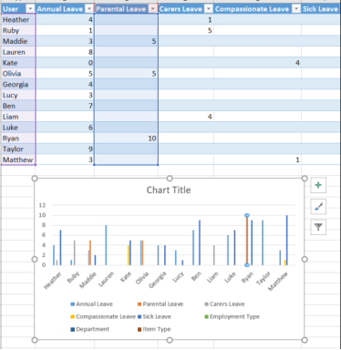
I can add multiple tables within this one workbook and do not need to reconnect my data each time. If I select and highlight my table again, select Recommended Charts, I can select and re-paste another table.
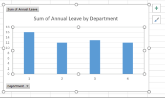
If I want to view this chart from directly in my excel workbook, I can select on the drop down filters here and sort through it
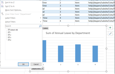
If I select my Chart, I will see further options become available to me on my right hand side under a menu called PivotChart Fields
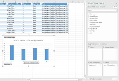
Here, I will have the ability to select any of the columns displayed in my SharePoint List and be able to drag the fields between different Filters, Legends, Axis and Values. For example, I may want to add the Employment Type into my chart:
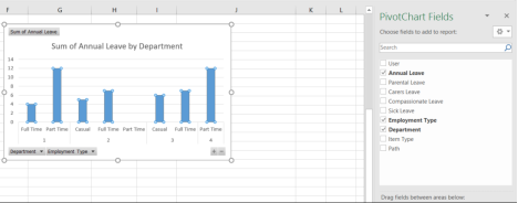
And then I can drag and drop Employment Type until I am satisfied with its categorisation.
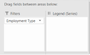
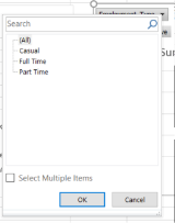
By adding Filter, you will see there is now an option within the chart to add the different types to the chart
To now save this chart, we must distinguish each chart from the other in our Workbook. This is a key part if we wish to publish our Workbook as we will later be referring these particular titles.
Select on the table/graph you wish to name. You will see within the Site Ribbon, the tab come up called Analyze
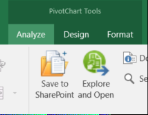
On the left hand side of this Ribbon, you will see a field and box named Chart Name

By default, it will most likely be named Pivot Table or Chart table etc. Name this table with no spaces and store it away to reference later. In this example I named the table “LeaveByDepartment”

I can name the rest of my charts within this to have the ability to reference them too. I will name my other graph “LeaveByEmployment”.
Navigate to the Save options as prompt the current URL of the extranet to save this workbook
Locate to the Document Library and save.
If you locate to the Site Contents of the extranet and navigate to the Document Library, you will now see your workbook within this library.
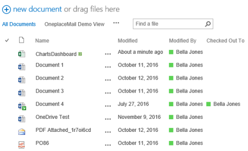
Check out and Edit the page, navigate to the Site Ribbon, through to the Insert tab and insert a Webpart.

Under Categories select Business Data and then Excel Web Access.
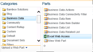
You will see the page now be loaded with the Excel Web Access Panel
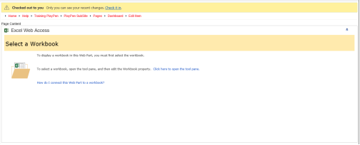
Select on the link which is titled Click here to open the tool pane.

On your right hand side, you will see a Workbook Display menu bar appear
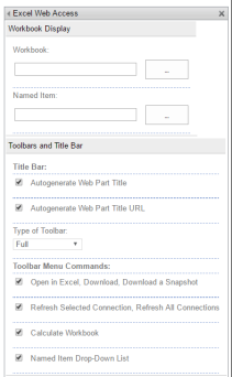
Select the elliptical points beside Workbook and navigate to your Workbook (which we have saved in our Documents Library)
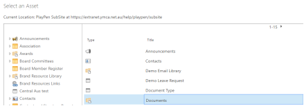

Now that you have selected it, you now must Name your item:
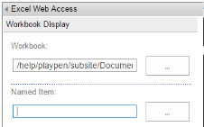
This is where we will reference the names which we distinguished within excel, for example: LeaveByDepartment and LeaveByEmployment
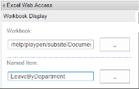
Select Apply at the bottom of the menu bar and your page will reference with the selected Chart.
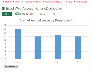
If I wish to add multiple charts but want them distinguished on my page, I can repeat the steps as above but this time reference my other chart by the table LeaveByEmployment
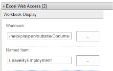
And you will see your two charts now available on your page.
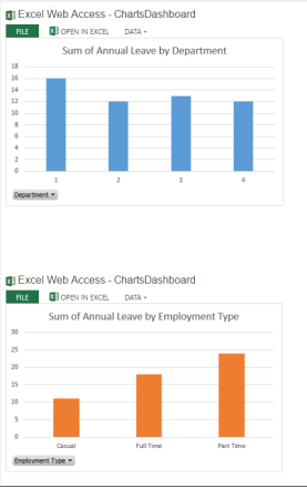
The benefit of this workbook being published to your page, is that you can continue to use this list as your basis of displaying information, refresh it and not have to re-create your charts or webparts.
To see this example being used, relocate back to the Reporting List within the Site Contents
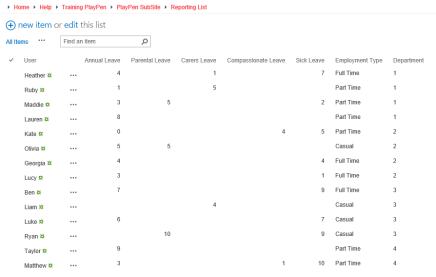
Say if within this example, I’d wish to change all Employment types of either Full Time or Part Time (in short, removing all Casual Employment Types)
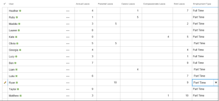
Save the changes and navigate to the Site Wheel and Site Contents.
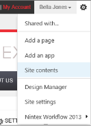
Locate to the Document Library and open the Excel Workbook

Once your Excel is launched, navigate to the Site Ribbon, and select the Data tab.

Select the icon which is titled Refresh All.

You will see your data be refreshed with the new changes in your workbook
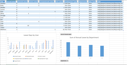
Locate to the Save options and close the workbook.

Continue back to the Site Wheel, selecting Site Contents and navigate back to the Dashboard page we created

And you will now see all of your charts updated with the new information.
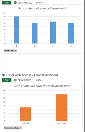
Although we have not specifically listed the other tables within this example, we can select the View drop down on the right hand side of the charts and scroll through any other tables we have created within this workbook.

